Note: This project was confidential, so I have omitted and changed some details.
Goal
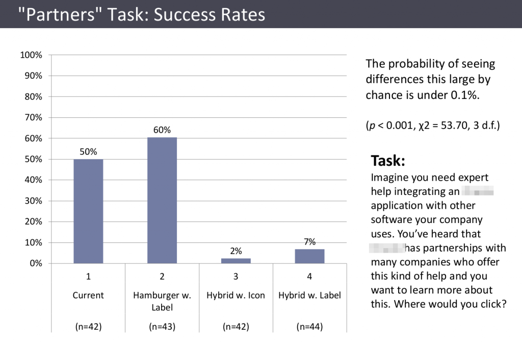
A large technology company was considering several design options for its website’s main navigation menu, varying in whether they had a “hamburger” menu icon, a “Menu” label, exposed top level menu items, etc. They wanted to know which design would best help users find what they were looking for.
Approach
When comparing different design options, a large sample size is needed in order to distinguish between differences that are real versus due to chance, so I used an online testing service that enabled me to have a large number of people attempt a set of 6 very short tasks, one at a time, using clickable images of each design option.
Example task: “Imagine you want to read about how other companies have used ____ products to achieve their goals? Where would you click?”
Results

1,035 responses (about 43 per task/design combination) provided not only clear quantitative answers but also valuable insights. It turned out that different designs had different strengths and weaknesses for different navigation tasks, in ways that illuminated tradeoffs and opportunities in designing the navigation, while also supporting a clear choice of which design to use.

Impact
Without this research, the company could easily have chosen a design liked by influential stakeholders, but which would actually have been much less effective. Thanks to the research, they were able to identify and use a design that was significantly better than the others at helping users quickly find what they are looking for. They were also able to make a few tweaks to the design that this research indicated would make that it work better across all tasks, not just most of them.